
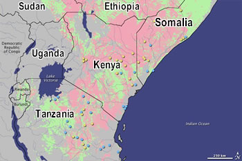
Pink areas depict increased risk of disease, while pale green areas reflect normal risk. Yellow dots represent reported RVF cases in high-risk areas, while blue dots represent occurrences in non-risk areas
http://hiiraan.com/news2/2009/Feb/nasa_ ... virus.aspx


